Redesigning the navigation for enhanced user flow and experience
I had the exciting opportunity to lead the redesign of the navigation bar, all with the goal of making the website's user flow more seamless and intuitive. By embracing the design thinking process, I took the time to understand and identify key pain points and craft thoughtful solutions. Working closely with the marketing team and design lead, I was able to gather essential insights and data to guide our decisions and prioritize what mattered most to the users.
ROLE
Graphic designer
TIMELINE
Sep 2023 - Mar 2024
SKILLS
UX/UI Design
Wireframing
Prototyping
Typography
TOOLS
Figma
FigJam
●
Introduction
Good navigation guides users
According to a study by Top Design Firms, 38% of consumers look at a page's navigational links and layout when looking at a site for the first time. Website navigation refers to the link structure and hierarchy of a website. The purpose of it is to guide users to where they want to go in as few steps as possible.
But..
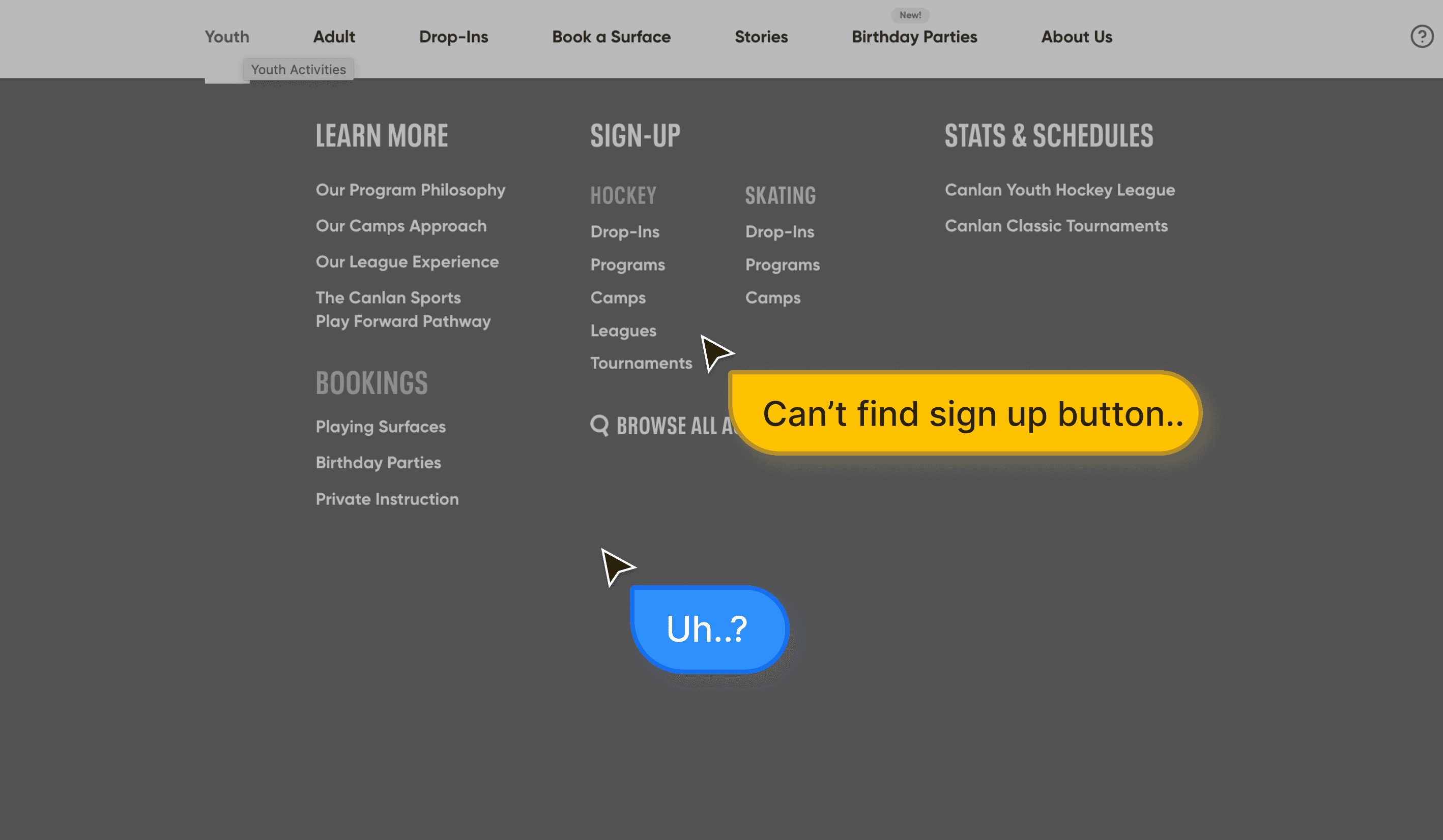
The current navigation isn't optimized for that.
Defining problems and shaping design strategies
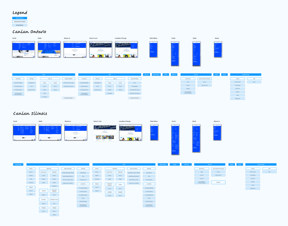
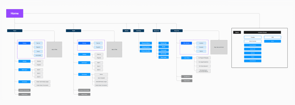
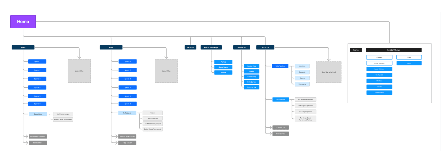
During the project, I faced some obstacles—primarily around the lack of data on the website’s overall strategy, which made it difficult to fully understand the "why" behind certain design choices. To tackle this, I began by mapping out the current user flow and creating an information architecture for the navigation. In the empathy phase, I gathered key customer insights, including personas, by collaborating with the CX manager and monitored the user research platform, Alida, to gather more insights. This helped me identify urgent issues that needed attention and allowed me to better understand the needs and frustrations of Canlan Sports’ customers. Afterward, I worked closely with the design lead to prioritize these findings ensuring we focused on the most impactful areas.
The challenges
There was no existing UX strategy, so I started by mapping out the current user flow and working with a few hypotheses to guide the way forward.
Limited data on user behaviour and the information architecture (IA) made it tricky to fully analyze how content is stored and ordered.
Each sports complex had its own unique set of programs and sports, so I had to find flexible solutions that worked across all locations.
The marketing team was short on manpower, which affected the timeline of the project.
●
Problems to solve
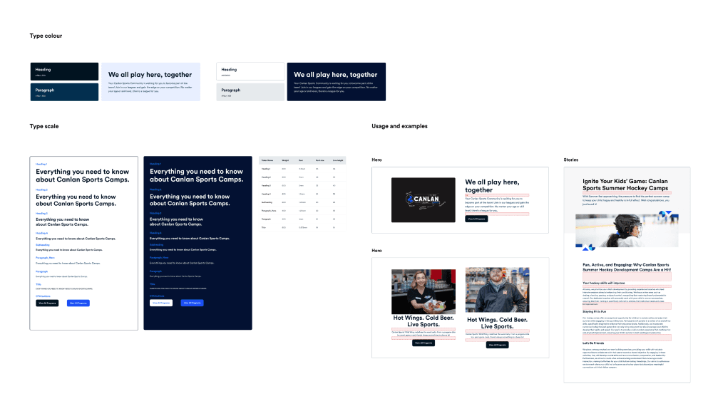
Readability and functionality were the main challenges, so I established consistent rules and created a clearer font hierarchy to improve the user experience.
There were too many redundant pages and items cluttering the site. Instead of a full redesign, I focused on reorganizing them within the existing website structure to streamline navigation.
Some content lacked clarity, so I added more descriptive text to help users better understand what each section offered.
●
Design strategies
With multiple campaigns and a big conference on the horizon, I knew this project needed a thoughtful, long-term approach. During the research phase, I uncovered some additional website performance issues that required attention. To keep everything on track and make sure we stayed aligned with the timeline, I broke the project into three manageable phases. This way, we could tackle the challenges step by step while ensuring continuous progress.
Phase 1: Implement a short-term solution to improve navigation. This involved creating quick fixes to address the immediate issues while keeping the existing website structure in place.
Phase 2: Roll out the new navigation and gather feedback from our customer community. This feedback, along with new data, would inform future website updates.
Phase 3: Develop a long-term UX strategy aligned with the marketing goals and CX data. This would lay the groundwork for a full website project that provides a more sustainable, long-term solution.
Early Ideation
Given the limitations of working within the existing WordPress framework, my main focus during this stage was on improving how the content was structured. I worked on organizing categories and simplifying the layout of links to ensure a better user experience. The challenge was to create a clear and easy-to-navigate interface without overwhelming users with too much information.
●
Version 1
A Simpler Experience
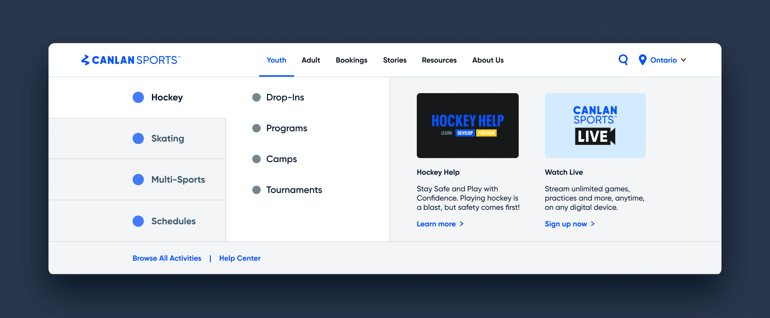
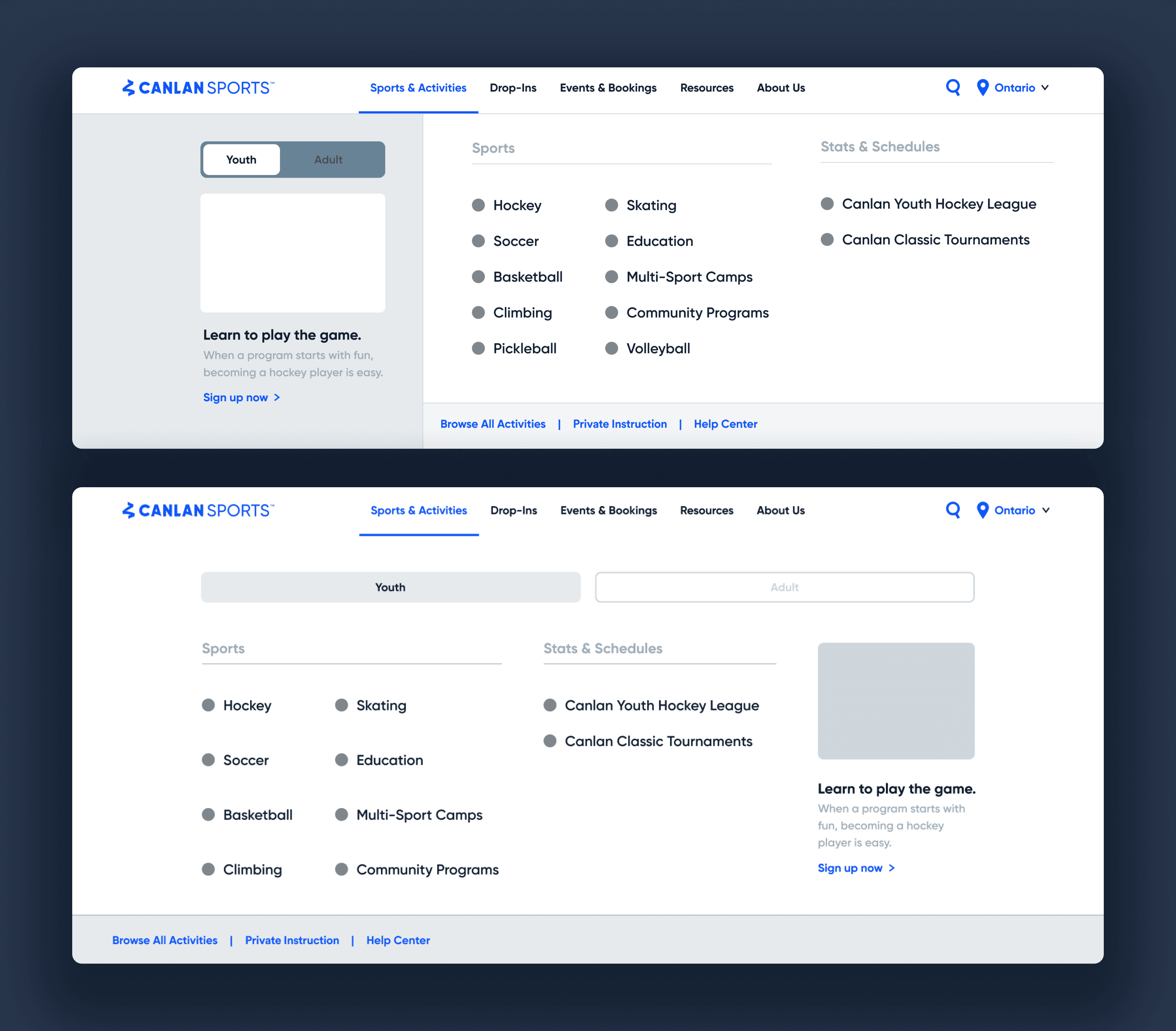
In my initial ideation, I introduced a mega menu to group-related content, ensuring users could find what they needed quickly and intuitively. Within the dropdown, I integrated sports tabs and brand blog content to create a seamless, user-friendly experience. I conducted a thorough content audit, identifying and eliminating redundant pages and items, which helped streamline the site. My focus was on clarity—ensuring the content hierarchy was intuitive and easy to navigate while keeping the language simple and accessible.
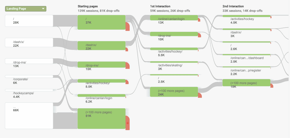
To create a more effective navigation structure, I needed a clearer understanding of how users interacted with the site. I reached out for additional user data, and with the marketing manager, we discovered that most users were heading straight to the Drop-ins page or accessing their dashboard through the DaySmart platform. This insight helped in shaping the next version of the redesigned navigation.
●
Version 2
Balancing Usability and Clarity
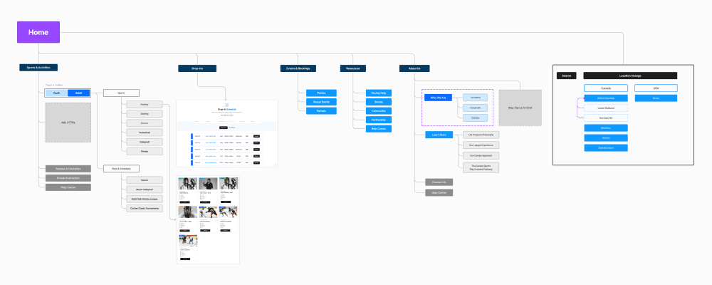
After our initial pitch, the team decided to keep the mega menu layout, which works well with Canlan Sports’ evolving strategies by clearly presenting the dynamic of services and products. This approach effectively engages both existing and new users. Building on previous feedback, I streamlined the high-level navigation bar while preserving the mega menu's benefits. I added a direct Drop-ins link for quick access. Collaborating with the marketing team, we refined page links and hierarchy, focusing on sports and minimizing dropdown activities. For age group selection, I introduced a toggle and tab UI for easy Youth and Adult options. Each sports landing page was designed to be dynamic and guide users smoothly to the DaySmart platform.
Design Review & Iterate
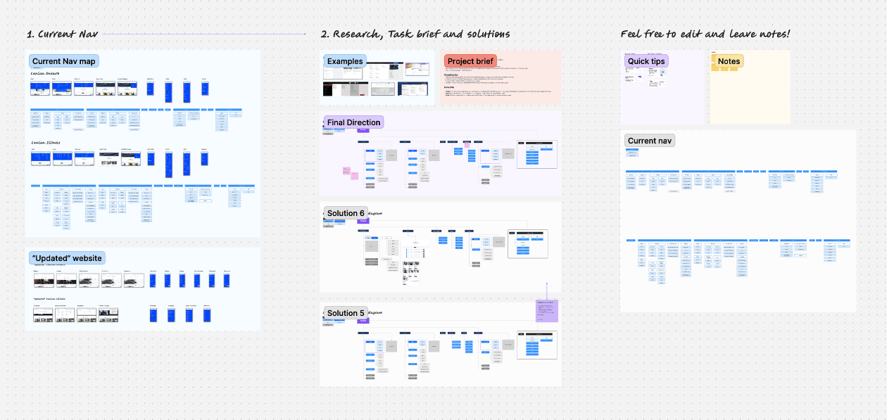
I created a FigJam file to review the design process with the marketing team before finalizing the new direction. This collaborative review was invaluable for gathering fresh ideas and perspectives on the design challenges, scopes, research findings, and decisions. It also served as a crucial sanity check to ensure alignment with our marketing strategy and user needs.
●
Final solution
Finalizing for Functionality and Impact
Readability and Consistency
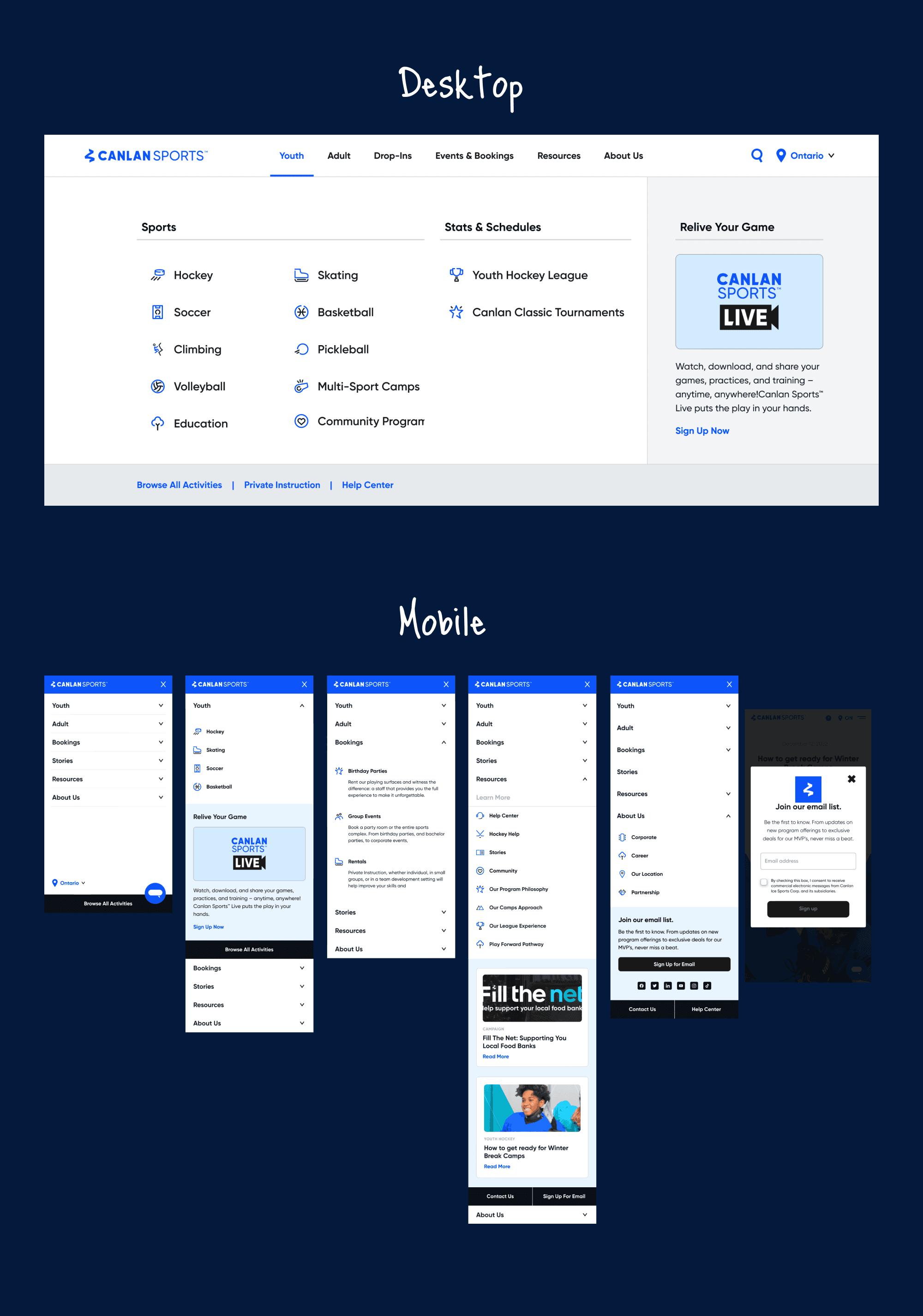
One key challenge was improving readability, so I established consistent font rules and a clear hierarchy to make the interface more intuitive. This helped to significantly enhance the user experience, especially on mobile devices, where text clarity is critical.
Streamlined Navigation
I simplified the layout by listing only sports instead of both sports and activities, which was particularly beneficial for mobile screens. This approach streamlined the navigation and improved usability, especially considering the heavy use of QR codes on both digital and print materials. Users were now led directly to sports landing pages, where all relevant activity information could be viewed without having to switch selections or navigate back.
Content Clarity & User Engagement
To address the issue of unclear content, I added more descriptive text to better communicate what each section offered. Additionally, I introduced a content section that highlights blogs and other key information to boost engagement. This not only made the site more informative but also kept users engaged by drawing attention to relevant resources.
●
Prototype
Let's bring it to life!
I maintained consistency in labeling and categorization, ensuring the navigation was intuitive and seamless across the site, which greatly improved the overall user experience. To bring the team on board, I created a detailed prototype that the marketing team could review and interact with, allowing everyone to see the solution in action and ensure it aligned with our goals. Though I relocated before the project was fully completed, I made sure to leave everything in great shape. I documented all my work thoroughly, provided clear design guidelines, and handed off detailed notes to ensure a smooth transition. The project was left in a ready-to-implement state, making it easy for my colleagues to pick up where I left off and move forward confidently.
Transforming Figma into an ecosystem
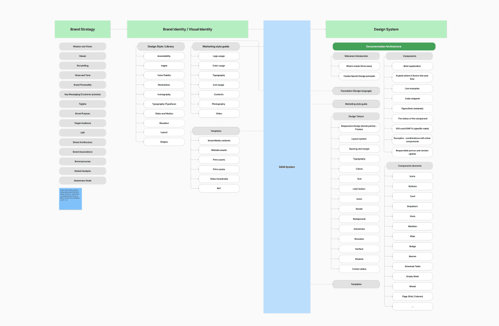
During this project, our design team was focused on building a design system in Figma to ensure consistency across all brands, streamline workflows, and improve communication. My role was to develop the structure, font, and spacing systems to create a cohesive design language. Around the same time, the company integrated the Bynder DAM system, and I was actively involved in that transition, working to align both systems for an efficient and organized design process.
●
Currently working on the Bynder project as a freelance designer.
Learning & reflection
This project gave me the opportunity to put my UX design and problem-solving skills to work, tackling key challenges and creating an intuitive, user-centric experience. The result was a solution that made it easier and more efficient for users to complete their tasks. Although I wasn’t able to continue working on the project after its release, I’m confident that the foundation I built set the stage for future development and highlighted the important areas for improvement.
Empathy empathy empathy!
Empathy played a huge role in this project. Understanding the users’ needs and frustrations was key to delivering a solution that truly worked for them. Empathy isn’t just a part of the process—it’s the foundation of creating meaningful and impactful user experiences.
Thanks to the CX manager, Danielle for sharing all the customer insights with me!
Stick with the DESIGN THINKING process
Sticking to the design thinking process was essential for this project’s success. It allowed me to keep the user front and center, while also refining the design based on ongoing feedback. By trusting the process, I was able to stay flexible, experiment with new ideas, and arrive at a solution that was both effective and scalable. This experience reinforced how important it is to stay true to the process, even when faced with challenges.
Thank you!
Thank you to the entire marketing team for all your invaluable insights throughout this project! Your feedback truly shaped the designs and made a big difference in bringing everything together. This has been a rewarding experience, and I’m deeply grateful for your guidance and support throughout the process.
